

Basics of Graphing
By Marvin Roberts, BA, MPS, MPA
Graphs make it easier to see and understand economic relationships by turning complex data into clear visuals. They help economists identify trends, patterns, and how different variables relate to each other. This makes graphs useful for both understanding economic theories and making real-world decisions.
The Cartesian Plane
- Developed by René Descartes, the Cartesian plane is a powerful tool for visually representing the relationship between two variables.
- It is made up of two perpendicular axes:
- The horizontal axis (X-axis), which represents the independent variable
- The vertical axis (Y-axis), which represents the dependent variable
- The point where these axes intersect is called the origin, marked as (0, 0)
- The plane is divided into four quadrants, each defined by the signs of X and Y:
- Quadrant I: (+X, +Y)
- Quadrant II: (−X, +Y)
- Quadrant III: (−X, −Y)
- Quadrant IV: (+X, −Y)
- Every point on the plane is represented as a pair of coordinates (x, y), showing its position relative to the axes.
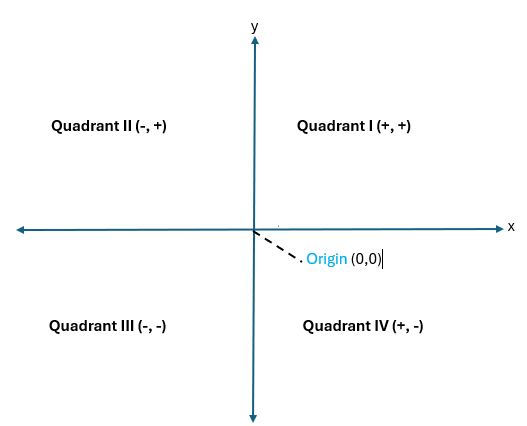
Understanding the Four Quadrants and Axes in the Coordinate Plane
-
Quadrant I:
-
Both the x- and y-coordinates are positive
-
This is the upper-right section of the coordinate plane
-
-
Quadrant II:
-
The x-coordinate is negative, while the y-coordinate is positive
-
This quadrant is located in the upper-left section
-
-
Quadrant III:
-
Both the x- and y-coordinates are negative
-
It represents the lower-left section of the plane
-
-
Quadrant IV:
-
The x-coordinate is positive, but the y-coordinate is negative
-
This is the lower-right section of the coordinate plane
-
-
Points on an axis:
-
Points that lie on the x-axis or y-axis (where one coordinate is zero) are not considered part of any quadrant
-
Coordinates of the form (x, 0) lie on the x-axis (horizontal)
-
Coordinates of the form (0, y) lie on the y-axis (vertical)
-

Slope
One way of describing the relationship between x and y or two variables is to use the slope of the line.
-
The slope of a line shows how one variable changes in response to another (rise over run)
-
A positive slope indicates a direct relationship (e.g., price ↑ → quantity supplied ↑)
-
A negative slope reflects an inverse relationship (e.g., price ↑ → quantity demanded ↓)

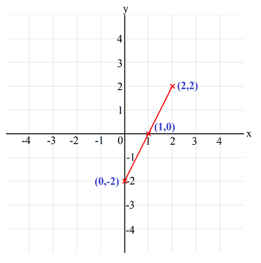
Positive Slope
A positive slope shows that as one variable increases, so does the other. In this case, as the number of hours studied increases, the test score also goes up. This is an illustration of a direct relationship.


The slope of 10 in this graph means that for every additional hour studied, a student’s test score increases by 10 points. This shows a positive, direct relationship between study time and performance—more hours of study lead to higher scores.

1. Plot the following points on the Cartesian Coordinate Plane
- (1.4)
- (-2,3)
- (4,-2)
2. Which of the following best describes the origin on a Cartesian plane?
A.The point where the slope is zero
B. The intersection of the X and Y axes at (0, 0)
C. The highest point on the graph
D. The area between two quadrants
3. Which quadrant would contain the point (−2, 3)?
A. Quadrant I
B. Quadrant II
C. Quadrant III
D. Quadrant IV
4. Which of the following describes the slope of a straight line?
A. The product of X and Y
B. The change in Y divided by the change in X
C. The point where the line crosses the Y-axis
D. The area under the line
5. What is the slope between the points (1, 2) and (3, 6)?
A. 2
B. 4
C. 3
D. 0.5
6. What does a negative slope indicate?
A. Y increases as X increases
B. There is no relationship between X and Y
C. Y decreases as X increases
D. X remains constant
7. What type of graph represents a changing rate of change?
A. A straight line
B. A horizontal line
C. A vertical line
D. A curved line
8. In a graph, if each unit increase in X causes Y to increase by the same amount, what is true?
B. The line is horizontal
B. The graph is a curve
C. The slope is constant
D. There is no relationship
9. Which of the following is a good question to ask when evaluating a graph for accuracy?
A. Does the graph look professional?
B. Is the graph colorful?
C. Has the origin been included, and are the scales consistent?
D. Was the graph made using a computer?
10. A 3D graph should be read carefully because:
A. It is more advanced and harder to understand
B. It can distort the relationship between variables
C. It always shows a positive relationship
D. It is only used for marketing
11. If a graph shows a curved shape that rises steeply, what does that indicate about the rate of change?
A.It is decreasing
B. It is constant
C. It is increasing
D. It is unpredictable
12. Identify the x and y values in each ordered pair below.
a. (1,3)
b.(4, −2)
c. (−25, −72)
13. Plot the following on a Cartesian coordinate plane:
a. (1, 2)
b. (-3, 4)
c. (2, -1)